The Crash Warning Checklist: 8 Signs History Says You Should Watch

Every major U.S. market crash, from 1929 to 2008, was preceded by the same cluster of warning signals. While no single metric predicts a downturn, history shows that when four or more red flags appear together, risk rises sharply. As of 2025, several of these indicators are again flashing warning signs. Here’s how to spot them before the next collapse.
- Extreme Valuations: When the S&P 500’s price-to-earnings ratio exceeds 25-30, history shows overvaluation. This preceded every crash since 1929.
- Soaring Margin Debt: Rapid leverage growth (25-30%+ year-over-year per FINRA) amplifies volatility, often signaling speculative excess.
- Inverted Yield Curve: When 2-year Treasury yields exceed 10-year yields, recession risk rises; this has predicted nearly every downturn in 50 years.
- Fed Tightening Into Weakness: Rapid rate hikes (2%+ within a year) while GDP slows have historically triggered crashes.
- Market Concentration & Euphoria: When the top 10 S&P 500 stocks exceed 35% of market value and investor sentiment stays in “Extreme Greed” for weeks, risk is near peak.
Market crashes don’t happen without warning. While no one can predict the exact timing of the next collapse, history shows that every major downturn is preceded by the same combination of red flags appearing together. When four or more warning indicators flash red at the same time, every major crash of the past century has followed.
The market meltdowns of 1929, 2000, and 2008 each had at least five or six of these signals appearing together. No single metric can predict a crash on its own, but when several align, risk increases dramatically. Below are the eight most predictive indicators ranked by historical importance, based on patterns observed over the past 100 years.
1. Extreme Valuations: Is the Market Too Expensive?
Importance: HIGHEST – Present before every major crash
The price-to-earnings (P/E) ratio shows how much investors pay for each dollar of company profits, similar to comparing a home’s price to the rent it earns. The long-term average S&P 500 P/E ratio has hovered around 15–16, based on long-term data from MacroTrends and Multpl.com. When valuations rise far above that level, the risk of a market correction tends to increase sharply.
Before major crashes, P/E ratios consistently climbed into historically high zones. In 1929, the market’s cyclically adjusted P/E (CAPE) exceeded 30, according to Shiller’s historical data. Before the 1987 crash, valuations were moderately elevated, around 18–20 based on S&P 500 earnings data. During the dot-com bubble of 2000, the P/E ratio surged above 30, while the Shiller CAPE hit a record over 40. Ahead of the 2008 financial crisis, the market’s trailing P/E hovered near 22, with the Shiller CAPE close to 27, as shown in Robert Shiller’s dataset.
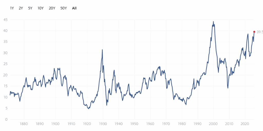
Source: Multpl.com
There’s no single “warning line,” but historically, when the S&P 500 P/E rises above 25, markets are considered overvalued, and readings above 30 signal extreme risk territory. Investors can monitor these valuation levels in real time through MacroTrends’ S&P 500 valuation chart or Multpl’s P/E tracker. As at October 2025 the S&P 500 P/E is 29.69.
2. Rampant Speculation and Excessive Leverage
Importance: VERY HIGH – Present in 1929, 2000, 2008
When investors borrow money to buy stocks, known as margin debt, it amplifies both gains and losses. High leverage means many are speculating with borrowed cash, and when prices drop, margin calls force rapid selling, deepening the decline.
Before major market downturns, margin debt has often surged during speculative peaks. In the late 1920s, brokers’ loans nearly doubled between early 1928 and October 1929 as investors borrowed aggressively to chase rising stocks. During the dot-com bubble, margin balances again reached record levels as day trading spread. In 2021, total U.S. margin debt climbed to an all-time high of about $935 billion, according to FINRA data, roughly 60% higher than the prior year, marking one of the fastest increases in decades.
Historically, rapid growth in margin balances has signaled excessive risk-taking. When markets reverse, forced liquidations can accelerate declines, turning corrections into crashes. While there’s no fixed threshold, risk tends to rise when margin debt grows more than 25–30% year-over-year or approaches 3% of U.S. GDP, based on Bureau of Economic Analysis comparisons. When leverage expands rapidly and retail trading activity spikes, history suggests markets are living on borrowed time.
3. Inverted Yield Curve
Importance: VERY HIGH – Predicted every recession in 50 years
Normally, long-term Treasury bonds pay higher interest than short-term ones because investors expect more return for lending money over 10 years instead of two. When this relationship reverses – meaning short-term yields rise above long-term yields, the yield curve becomes inverted. This inversion signals that investors expect slower growth or a possible recession ahead.
Historically, an inverted yield curve has preceded nearly every U.S. recession in the past half-century, with only one notable false signal in the mid-1960s. Data from the Federal Reserve’s FRED database show that the 2-year minus 10-year Treasury spread turned negative well before the recessions of 1981, 2001, 2008, and 2020. In early 2023, this inversion reached its deepest level since the early 1980s, more than, 100 basis points, reflecting widespread pessimism about future economic growth.

Source: FRED
The warning zone begins as soon as the 2-year yield exceeds the 10-year yield. The longer the curve stays inverted, especially beyond three months, the greater the recession risk. You can monitor real-time data using the official U.S. Treasury yield curve or the FRED 10Y–2Y spread chart.
If the spread remains negative for an extended period, history suggests the economy may already be operating on borrowed time.
4. Federal Reserve Tightening Into Weakness
Importance: HIGH – Key factor in 1929, 2000, 2008
When the Federal Reserve raises interest rates to cool inflation or an overheating economy, it makes borrowing more expensive for consumers and businesses. Higher rates slow corporate profits and can burst asset bubbles. If tightening continues while growth is already weakening, it often becomes the spark that triggers a market downturn.
In 1929, the Fed lifted its discount rate to 6% in August to curb rampant stock speculation, the market collapsed two months later. Before the 2000 dot-com crash, the Fed raised rates from 4.75% to 6.5% within a year. Leading up to the 2008 financial crisis, rates climbed from 1% in 2004 to 5.25% by mid-2006, contributing to the bursting of the housing and credit bubbles.
Source: New York Fed
The warning zone emerges when the Fed increases rates by 0.5% or more in one meeting, or over 2% in a year, while economic data, such as GDP growth or job creation, begins to weaken. You can track upcoming policy decisions on the Federal Reserve Meeting Calendar and monitor real-time changes to the Federal Funds Rate.
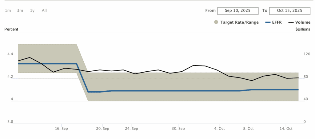
If rate hikes accelerate while the economy slows, history shows markets rarely escape unscathed. The Fed is expected to lower rates before the end of the year, not increase them.
5. Extended Bull Market with Euphoria
Importance: HIGH – Context that enables other factors
After years of rising stock prices, investors often grow overconfident. They begin to believe “it’s different this time”, that stocks can only go up and traditional valuation rules no longer apply. This irrational exuberance, as former Fed Chair Alan Greenspan described it, leads investors to ignore risk and chase momentum at any price.
The warning signs are easy to spot: a bull market running longer than 5–7 years, extreme optimism dominating headlines, and widespread FOMO driving decisions. In such phases, people quit stable jobs to trade stocks, and everyday conversations turn into investment advice. Before the 1929 crash, newspapers and public sentiment were filled with unshakable confidence that the market’s rapid rise was permanent, a belief that quickly unraveled.
The warning zone appears when a bull market lasts over 8–10 years and annual returns exceed 15%, often signaling overheating. You can track sentiment with the CNN Fear & Greed Index, which measures investor emotions, and monitor optimism through the AAII Investor Sentiment Survey.
If the Fear & Greed Index stays in “Extreme Greed” (above 75) for weeks while the bull market stretches beyond a decade, history suggests caution, because that’s when euphoria turns to excess.
6. Slowing Economic Growth Despite High Stock Prices
Importance: MODERATE-HIGH – Creates vulnerability
When the real economy, measured by jobs, manufacturing, and consumer spending, starts to slow but stock prices keep rising, it signals a dangerous disconnect. Markets are meant to reflect business performance, not speculative optimism. When that link breaks, risk builds silently beneath the surface.
The warning signs are clear: GDP growth drops below 2%, unemployment begins to rise, and corporate revenue growth weakens, yet stock indexes continue setting new records. This same pattern appeared before the 2000 dot-com bust and the 2008 financial crisis, when valuations stayed elevated even as economic data softened.
The warning zone emerges when GDP growth turns negative or remains under 2% while the market climbs sharply. Investors can track quarterly output in the Bureau of Economic Analysis GDP reports, leading indicators via the Conference Board’s Leading Economic Index, and monthly job data from the U.S. Department of Labor.
If economic growth is fading while stocks are still rising 10%+ per year, history suggests markets are running on sentiment, not fundamentals.
7. Extreme Market Concentration
Importance: MODERATE – Amplifies crash impact
When a handful of mega-cap stocks dominate the market’s total value, the entire index becomes fragile. It’s like putting all your eggs in just a few baskets, any weakness in those leaders can drag down the whole market.
As of 2025, the top 10 companies in the S&P 500 account for roughly 36% of the index’s total market capitalization, according to S&P Global and Bloomberg data. This level of dominance, driven largely by the “Magnificent 7” (Apple, Microsoft, Amazon, Nvidia, Meta, Alphabet, and Tesla), is among the highest in history, even surpassing the concentration levels seen during the dot-com bubble.
The warning zone begins when the top 10 stocks exceed 30% of total market value. Once that share rises above 35%, concentration risk becomes extreme, meaning the market’s fate depends heavily on a few companies’ earnings and sentiment. You can track updated data through S&P Global’s official site or your broker’s market research portal, and financial media regularly cover these imbalances when discussing the “Magnificent 7.”
If the largest 10 companies represent more than one-third of the S&P 500’s value, history suggests the market is dangerously top-heavy and increasingly vulnerable to a single-stock shock.
8. Record Debt Levels
Importance: MODERATE – Increases systemic fragility
When governments, corporations, and households all carry record debt loads, the financial system becomes fragile. A small economic shock can quickly cascade into crisis because everyone is overleveraged and liquidity vanishes when it’s needed most.
As of Q1 2024, global debt reached a record $315 trillion, equivalent to roughly 333% of global GDP, according to the Institute of International Finance (IIF). In the United States, total debt across public, corporate, and household sectors remains near historic highs, with federal debt surpassing $34 trillion and nonfinancial corporate debt close to 50% of GDP, based on Federal Reserve and U.S. Treasury data.
While there is no universally agreed-upon threshold for danger, systemic stress tends to rise sharply when overall leverage remains excessive. Economists generally view total-debt-to-GDP ratios above 300% as a zone of heightened vulnerability, especially when combined with high interest rates or tightening credit conditions. Investors can monitor global and sector-level leverage through the IIF Global Debt Monitor and the Federal Reserve’s Financial Accounts.
When debt levels stay elevated for extended periods, history shows that even minor shocks, such as policy tightening or slowing growth, can expose hidden fragilities across the system.
How to Monitor These Market Crash Indicators
A disciplined investor should check these metrics regularly. Each month, spend 15 minutes reviewing the S&P 500’s P/E ratio on Multpl.com, the CNN Fear & Greed Index, the Treasury yield curve spread between two- and ten-year bonds, and recent Federal Reserve policy statements.
Every quarter, take a deeper dive. Review all eight indicators, note how many are in the warning zone, examine margin debt levels, and compare GDP growth and employment data. This structured approach transforms random news into actionable insight.
Understanding the Risk Threshold
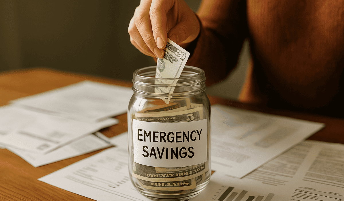
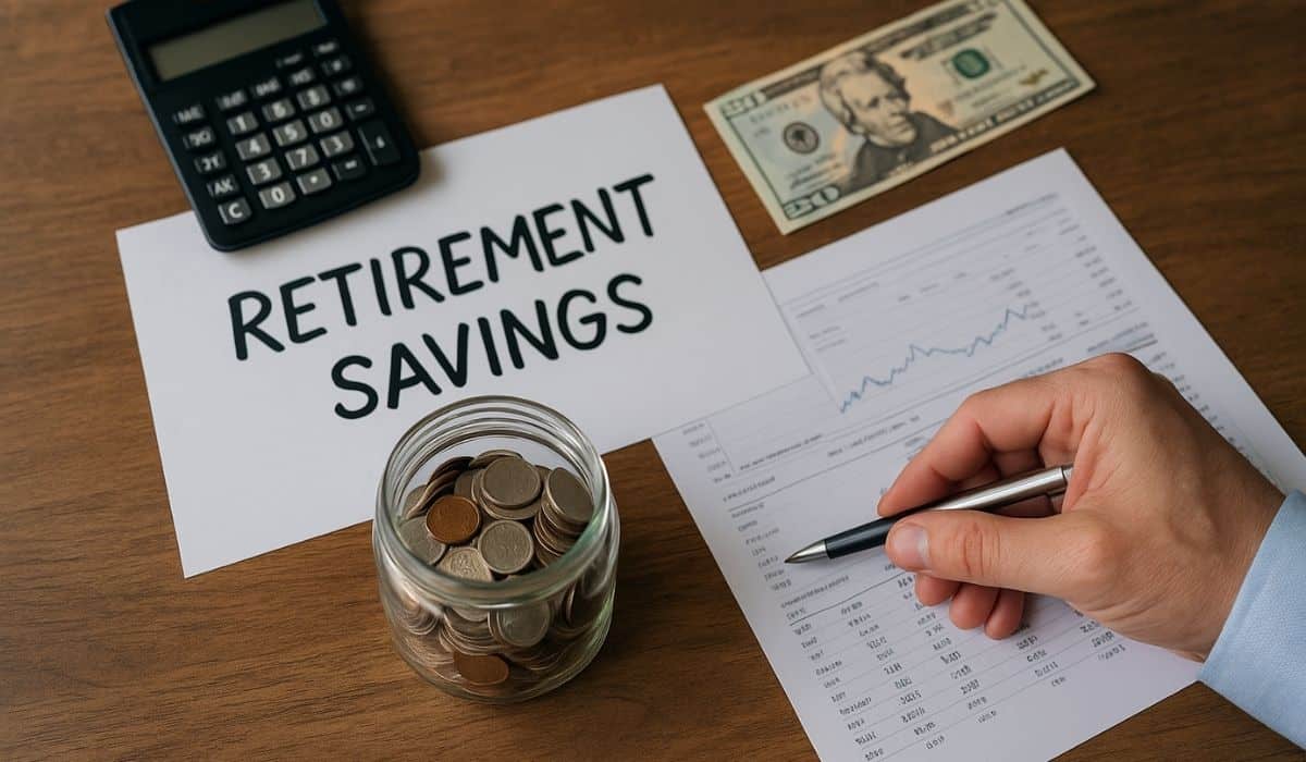
If one or two warning signs are active, the market remains within normal risk levels, stay invested and monitor trends. When three indicators flash red, risk becomes elevated, and rebalancing to your target asset allocation may be wise. If four or five indicators signal danger, risk is high; ensure sufficient cash reserves and review your portfolio’s concentration. Once six or more appear together, risk is extreme. This was the setup seen before 1929, 2000, and 2008. At that point, reducing exposure, especially for those nearing retirement, becomes prudent.
Critical Reality Check
Even when all eight indicators are flashing, markets can stay irrational longer than expected. The first warnings before the 1929 crash appeared months before the actual decline, but optimism drowned them out. The goal isn’t to time the exact top, it’s to build resilience.
When several of these warning signs cluster, it’s time to review your asset allocation, strengthen your cash reserves, and ensure you’re not taking more risk than your timeline allows. History has shown one consistent truth: when these signals converge, the question isn’t if a crash will happen, but when.
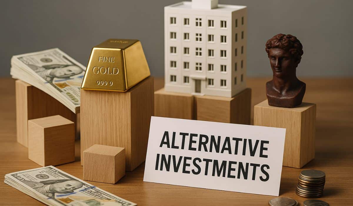
About Portfolio Strategy
Portfolio construction sits at the core of long-term investing. It determines how risk is balanced, how returns are captured, and how portfolios survive periods of volatility, drawdowns, and changing market conditions.
Explore the full framework in our Portfolio Strategy guide.